What Is a Color Wheel?
A color wheel is an illustrative model meant to aid people in picking colors that look good together. Though there are countless variations of the color wheel, the most common model is a wheel of twelve hues that comprises three core colors and their derivatives. Let's take a closer look at its construction.

Primary, Secondary, and Tertiary Colors
Primary Colors
Three unique colors, known as primary colors, provide the basis for the color wheel. These are red, blue, and yellow. Mixing equal portions of each of these three hues produces white.

Secondary Colors
Secondary colors are formed by mixing together equal portions of any two primary colors. These include green, orange, and purple.

Tertiary Colors
Tertiary colors are the result of mixing a primary color with a neighboring secondary. For example, mixing equal portions of green and yellow creates a hue known as yellow-green. As you can see, the tertiary colors complete the color wheel.

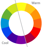
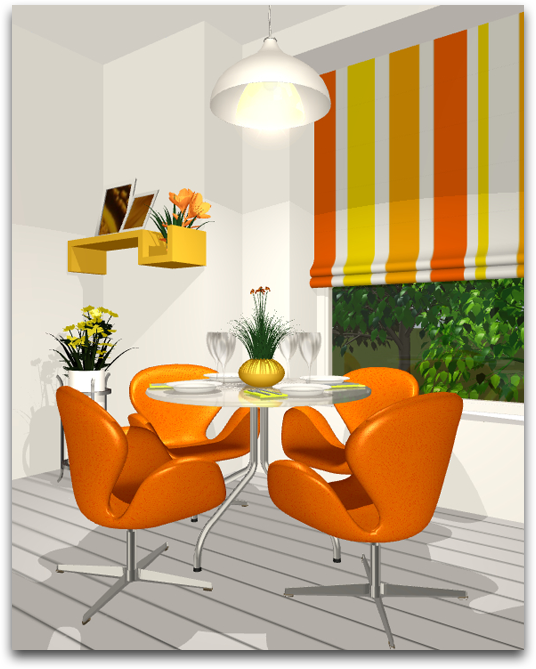
Warm and Cool Colors
The colors of the color wheel can be divided into two categories according to the atmosphere and emotions they provoke. Vivid hues that bring about a sense of warmth are labeled warm colors. This includes hues from red-violet to yellow.
Hues that generate the exact opposite feeling are called cool colors. They are more passive than warm colors and tend to be associated with cool temperatures and relaxation. All hues from yellow-green to indigo are considered cool colors.
Neutral Colors
Weaker colors that draw little attention to themselves are known as neutral colors. These include shades of white, black, and gray. Neutrals are very easy to work with since they blend easily with almost any color scheme.
Color Schemes
The color wheel is a valuable tool when it comes to choosing a color scheme. There are a few methods available for using the wheel to select a combination of colors that harmonize with each other.
Monochromatic
Using different shades and tints of one single color is called a monochromatic scheme, which is perhaps one of the safest and easiest to work with. The monochromatic scheme is light on the eyes and gives off a soothing and balanced air. One drawback to this scheme is that accenting focal points of a design becomes more difficult due to the lack of color contrast.

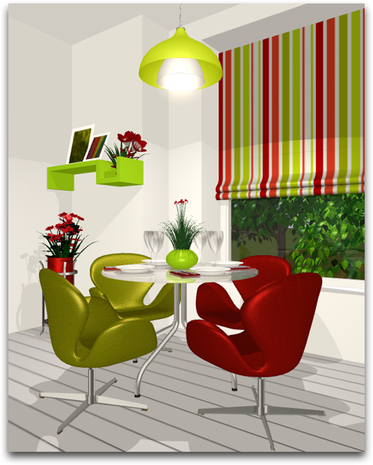
Analogous
One might think of analogous colors as neighbors since they are adjacent to each other on the color wheel. Analogous colors inherently look good together since they have similar origins. This scheme is often found in nature.

The monochromatic and analogous color schemes really have a lot in common. They are both easy to work with and provide an atmosphere of balance. However, an analogous scheme offers a bit more contrast. It is best to avoid adding too many hues and combining warm and cool colors together when working with this scheme.
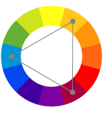
Complementary
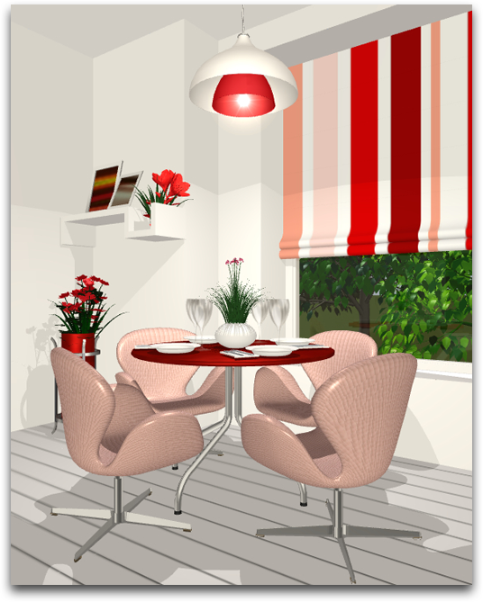
Any two colors located opposite of each other on the color wheel are termed complementary colors. As implied, complementary colors enhance each other and almost always look great together. You see this scheme in many aspects of your everyday life. For example, the reds and greens of Christmas.

The high contrast between two complementary colors produces a bold, vibrant effect that draws maximum attention to itself. However, this scheme does not always work well in large doses. You can avoid overdoing it by selecting one dominant color and using subtle hints of the other. Note that using two sets of complementaries is known as a tetradic scheme.
Split Complementary
The split complementary scheme is derived from the complementary color concept. You get such a scheme when you take a base color and the two neighbors of its complementary color (opposite). Though more difficult to balance than a monochromatic or analogous scheme, a split complementary scheme offers the contrast of complementary colors without the intensity.

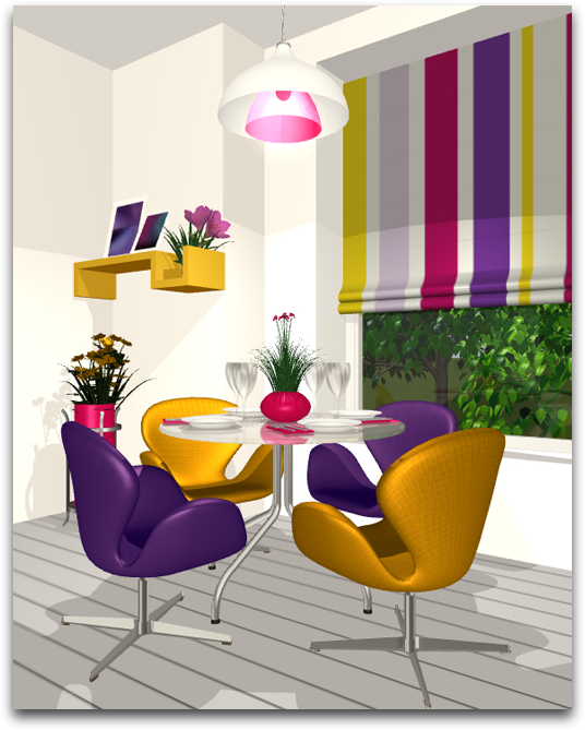
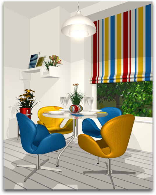
Triadic
Using any three colors equally spaced around the wheel is known as a triadic scheme. For example, green, orange, and blue. The effect of a triadic color scheme is very similar to that of the split complementary scheme in that it produces a vibrant yet subtle effect. The best way to balance triadic colors is to select one dominant hue and use the remaining two for accent.
Applying Color Theory
By no means is color theory meant to be a definitive guide for decorating an interior. It is a system that provides a basic understanding of color and a set of concepts meant to be experimented with. Take some of these schemes and experiment with them in Live Home 3D on your iPad, iPhone, Android, Windows or Mac device to gain your own practical knowledge of color and design. You can start by using one of the many tools available in the internet for working with the above mentioned color schemes as well as others. Our favorite is Adobe Color.